
About GameRevolution
Often referred as “GameRev” for short. It is your go-to website for videogame-related news, reviews and all button-pressing-buzz. As expected for a brand that has been around for about 21 years, with over 282,000 messages, nearly 100,000 members, and interest expressed within the community, a redesign had to happen.

Ooooh, the old-timer. Attractive for SNES era, maybe.
Business Goals
- Increase Viewability on Ads
- Increase our session rate is our main goal. Direct referrals rest only in our loyal users.
- Migration to a high-traffic WordPress based CMS will allow to rework look and feel.
- Page load speed: Limit to fewer items to load on the server.
Personas
We did not elaborate personas with the correct methodology taking fears and motivation per sei, however we did base it in two profiles:
Alvaro is a 22-year old who's passionate about videogames, mainly on watching competitive e-sports (EVO) streaming content, new xbox, steam an ps4 releases but has never visited GR. Also, he enjoys reading threads on reddit, where he gets the intel for purchasing a game which he does not often do. He does not like to be out of the discussion with friends about the industry.
Alvaro is a 22-year old who's passionate about videogames, mainly on watching competitive e-sports (EVO) streaming content, new xbox, steam an ps4 releases but has never visited GR. Also, he enjoys reading threads on reddit, where he gets the intel for purchasing a game which he does not often do. He does not like to be out of the discussion with friends about the industry.
Cody is a 31-yo who grew up with the boom of videogame industry, he´s been a follower of GR for quite sometime. He likes specific site features and likes to comment on posts and threads within the site. He fears that a game does not meet expectations after the purchase.
One embodyment Battousai8 who originally commented this in the site:
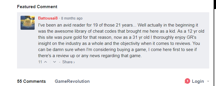
Link to Original Post. GameRev Fans are LOYAL!
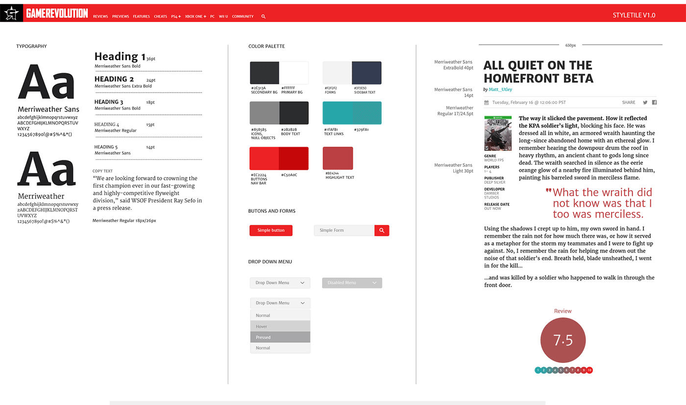
Round 1: Moodboard/Style Tile
Enter the team first challenge after finding our persona: A new logo. Next step is getting ready a mood board-style tile for stakeholders to see and approve
Just Some of the iterations the logo suffered.
Wireframing mobile and desk
GameRevolution is one of the most robust-information-wise site the team's ever faced: it’s not too surprising that the page code and indexing has accumulated a wealth of optimization issues over the years. Most of new features were improvised on-the-go, hence it had too many broken -and unordered- routes.
After we ran a sitemap diagnostic we made the decision to tackle and wireframe Game page, it had almost every element users can access and interact within the whole site.
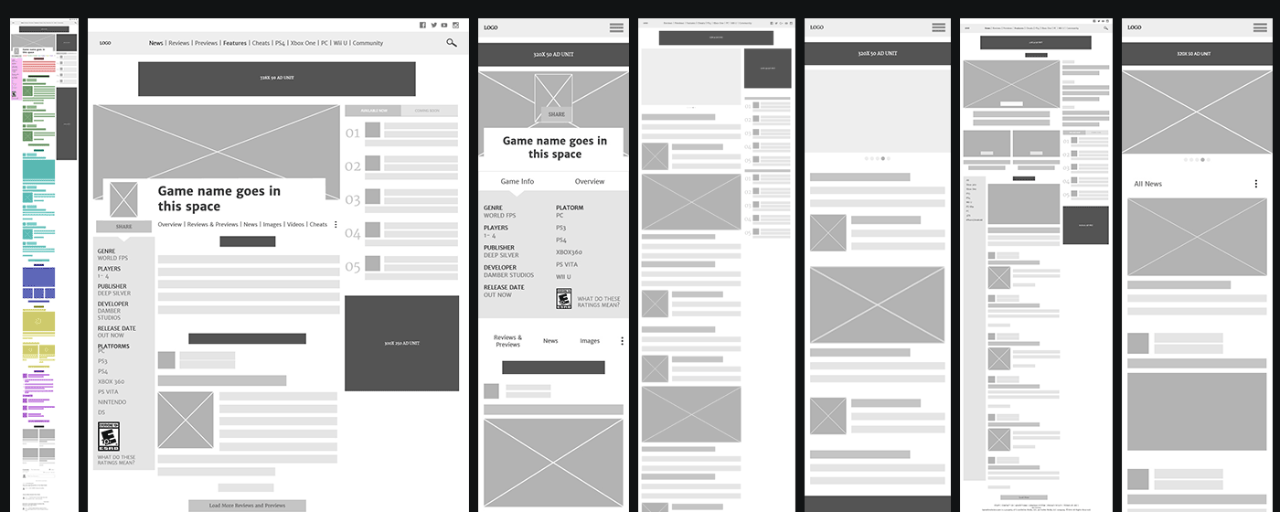
Kill the final boss, then take care of the henchmen: first page to wireframe was Game Page Desktop and Mobile
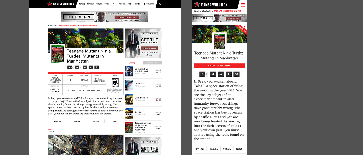
Guerilla Look & Feel Test
For the first time, a multidisciplinary team was involved into the project from the start. Marketing, Project Managers, Front End and BackEnd Devs came up with the idea of getting chief Editor Jonathan Leak on board to take advantage of GR's super-active forums and tease the new logo as a video post produced by our Multimedia Team in a thread to know early impressions. Let's find out the hype.
Once wireframes were approved by PM's and accepted by the majority of users in the forums, look and feel was integrated into mock-ups.
Homepage menu behavior on both desktop and mobile
Validation Strategy
Forums were helpful before, once again John posted a thread asking users to comment their feelings on the new look after launch.
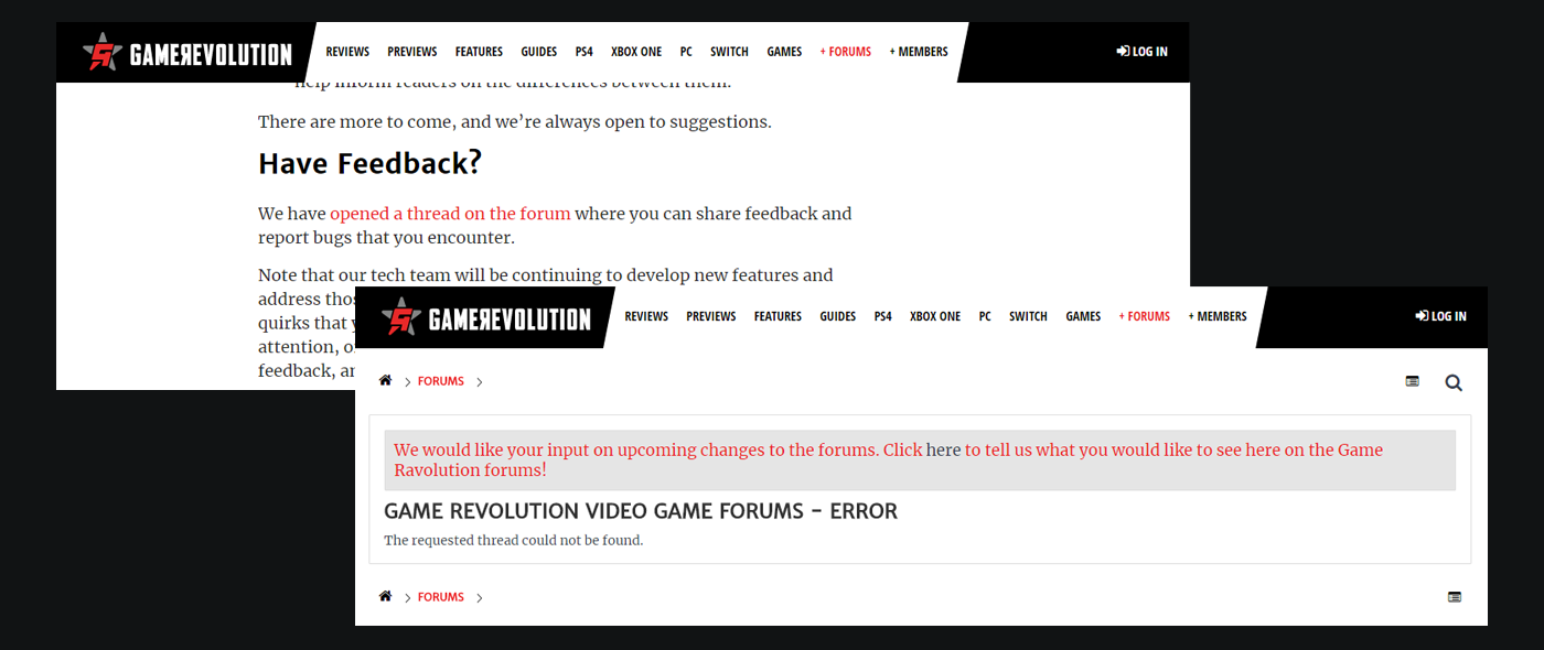
Original post can be seen here even though the forum thread is not available anymore
Iteration based on validation
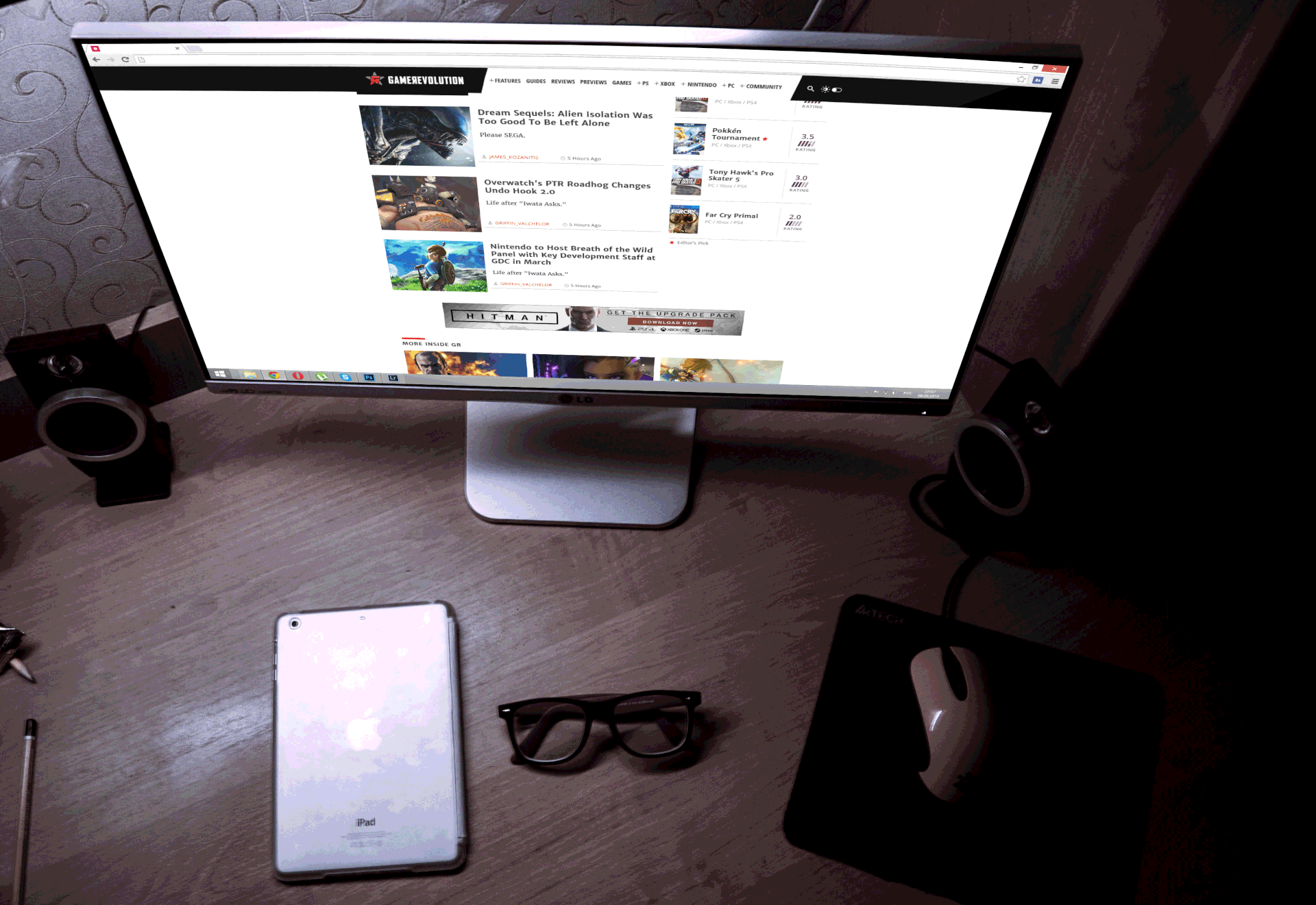
Site was accepted widely. For our surprise there was a general concern that the team didn't take in count a priori: Users often visit the site during night. So the clean white-background-look was too bright for browsing during nighttime. Enter GR's Dark Theme.
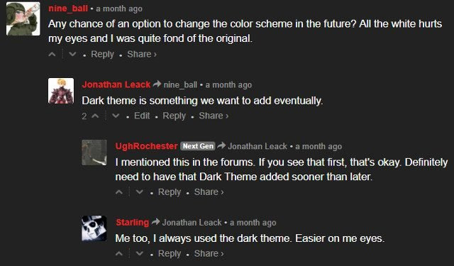
O.K. so we hurted your eyes! Back to design table!
We asked a variety of co-workers with different mind sets (accounts, designers, devs) to draw us a system to switch the color scheme, after that we asked them where should it be located. This last question encouraged some of them to re-think their design. Afterwards, design team translated modal characteristics into mocks.
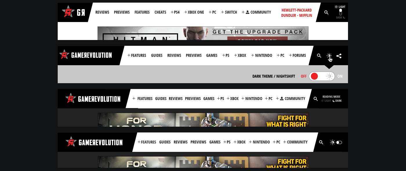
Night theme finalists
Mock ready in hands, the "iOS switchy" toggle button was widely accepted at first glance by another set of users because it resembled the toggle switch on iOS devices. in this particular case, we designed by the extremes on opposite sides of the curve. No place for ambiguity.

That's it! Thank you for playing
Oh, wait. Forgot to mention we designed THE BEST 404's out there for this website?
