
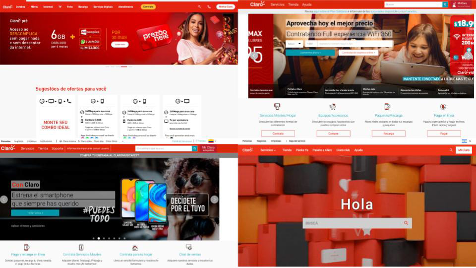
Examples of differences in a landing page from country to country (Clockwise from top left: Brazil, Chile, Colombia, and Argentina)
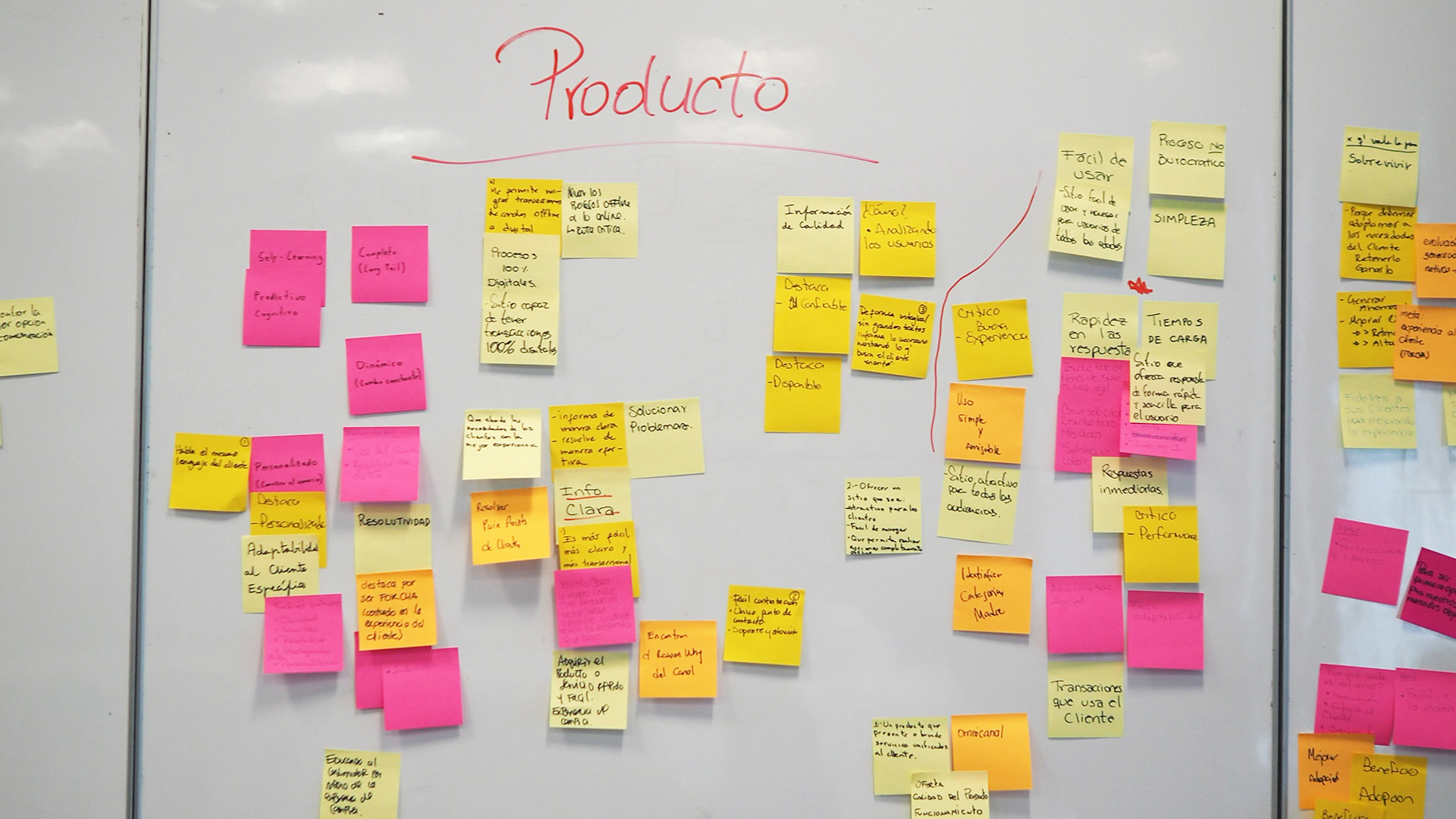
We started off with a couple of workshops to have a better understanding of the products and their business goals as well as the challenges they were facing.
We ran a Brand Distillation workshop with key stakeholders to have a better understanding of the brand's positioning.
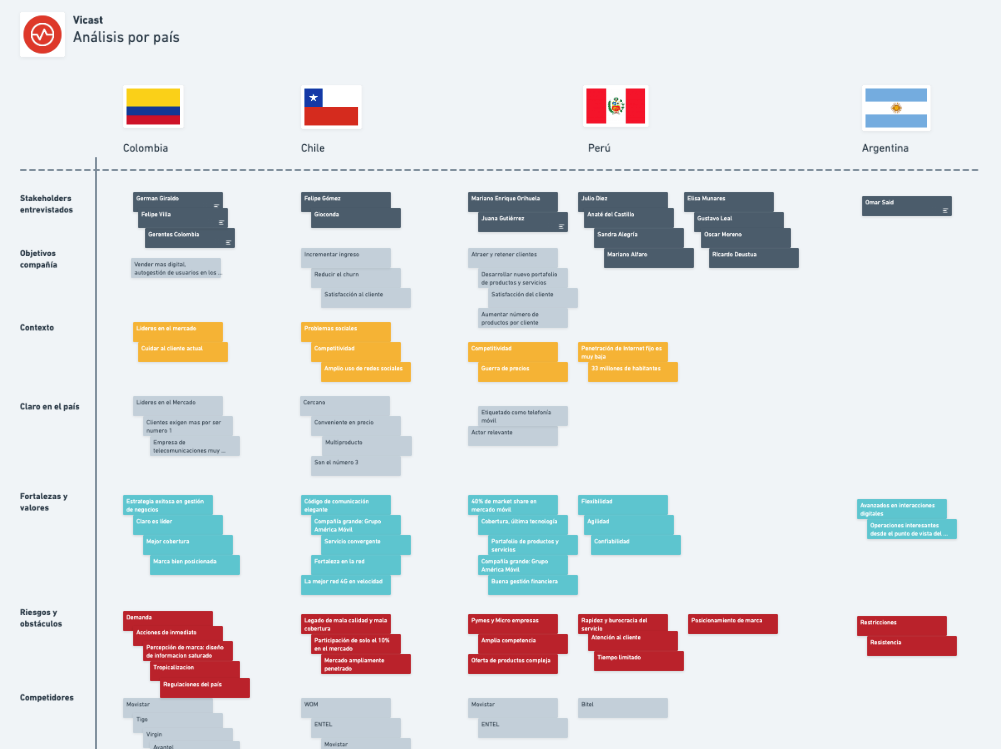
After interviewing a series of key stakeholders spread over four countries, we could map out the business goals and challenges across the different regions.
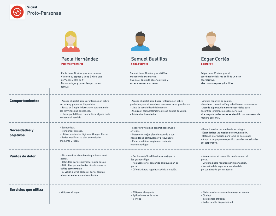
We were able to identify three proto-personas we would later validate through research.
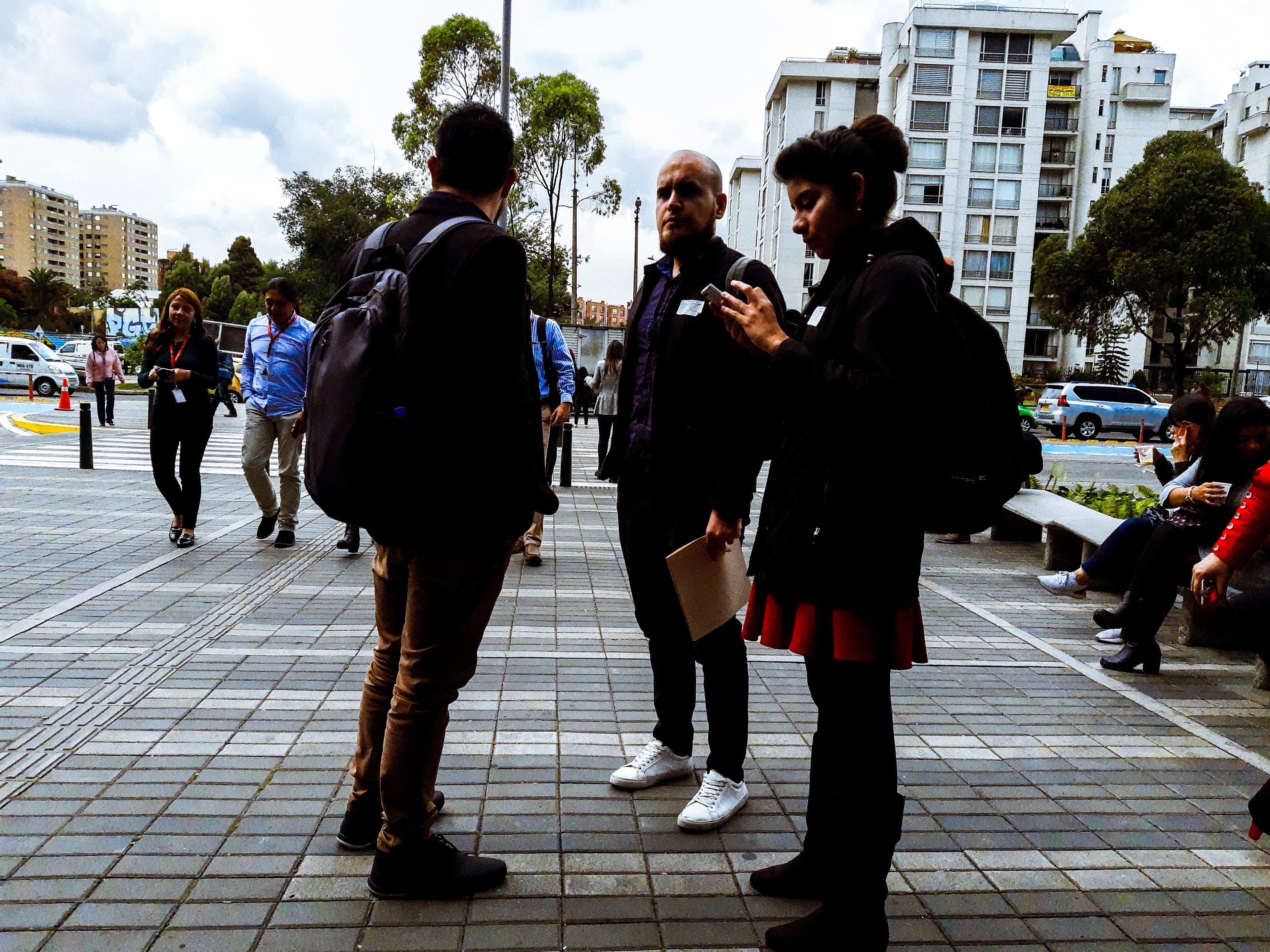
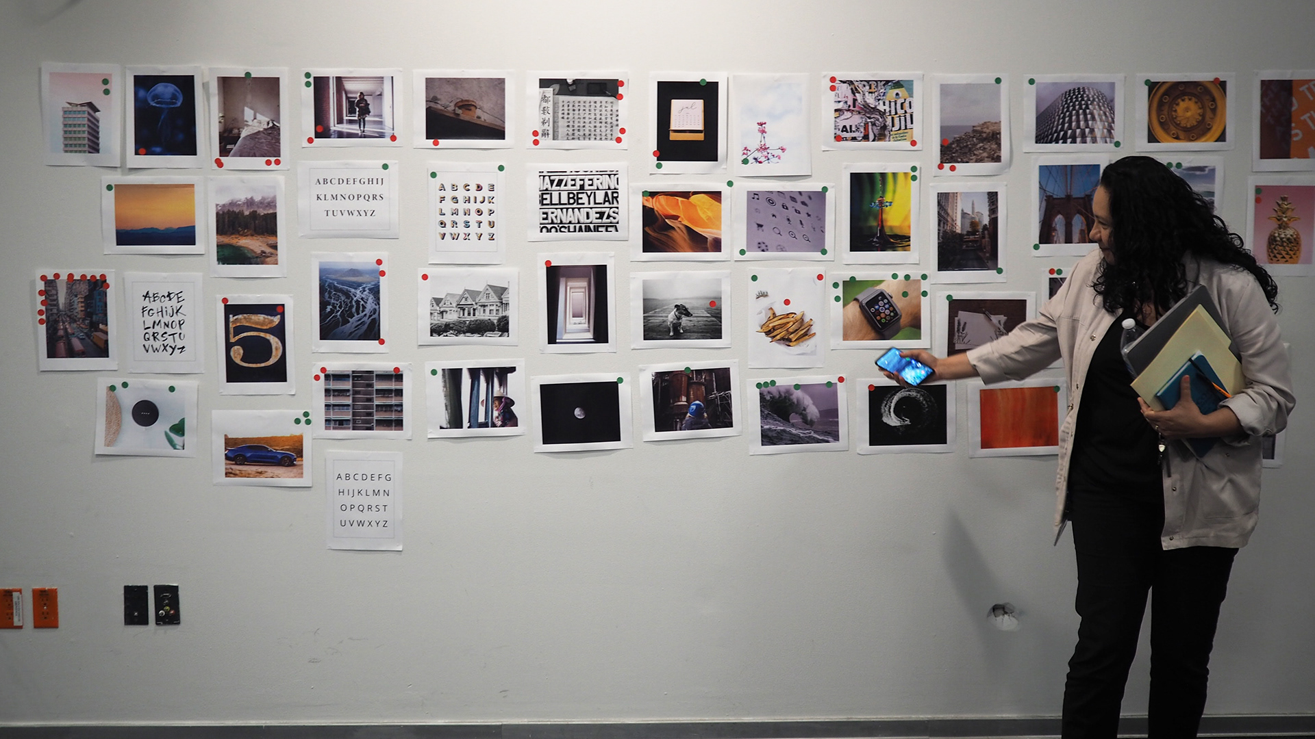
Our team of 1 Design Lead (myself), 1 UX researcher, 1 UX designer, and 1 Visual designer got to travel for three weeks to three countries in LATAM (Colombia, Peru & Chile) to engage in contextual inquiries with actual users

We interviewed 6 people per user personas; a mix of lab and contextual inquiries were used as a research methodology.
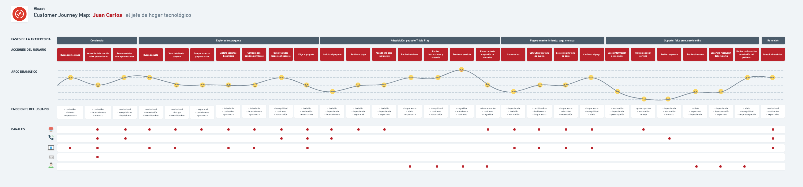
Insights were then processed to create our validated personas journeys.
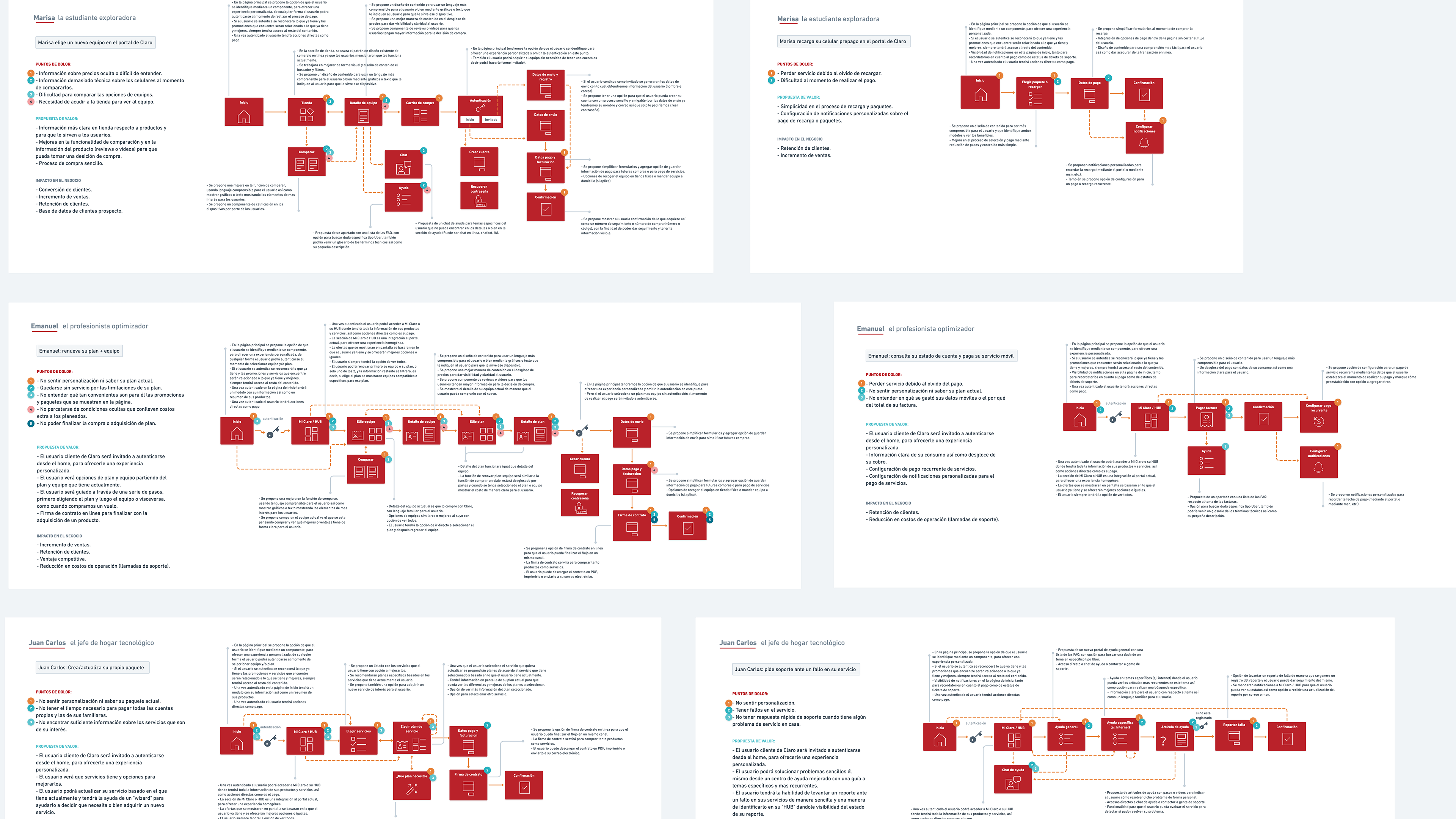
Our team got to work on user flows that would at a later stage go into design production
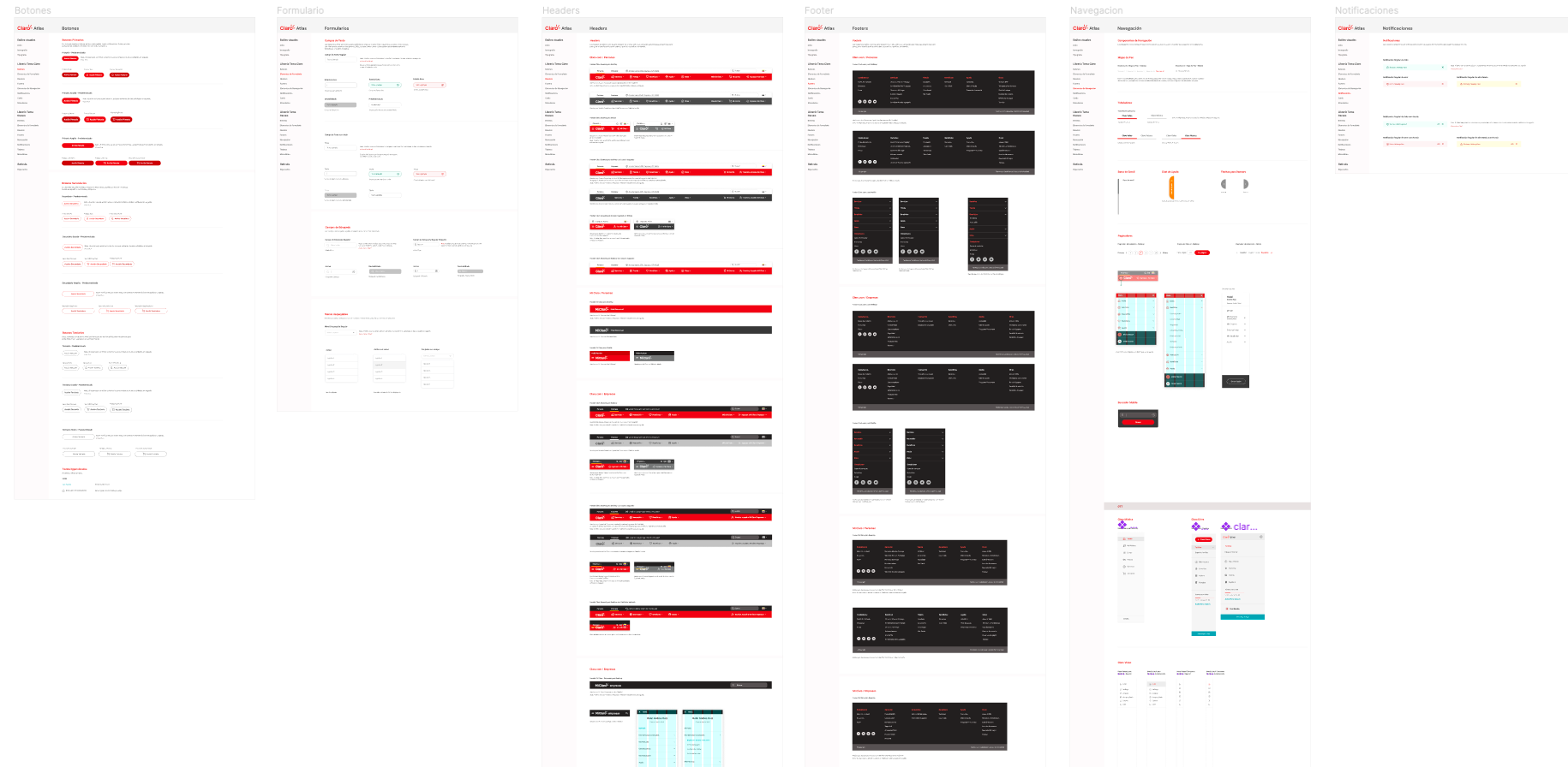
After distilling the brand, it was clear what elements we needed to begin creating the design system, or as we called it Atlas Design System. The one shown here is the light version.

One of the insights revealed during research was the need for the users to switch to dark themes on will, see Atlas was also built to have both light and dark themes.
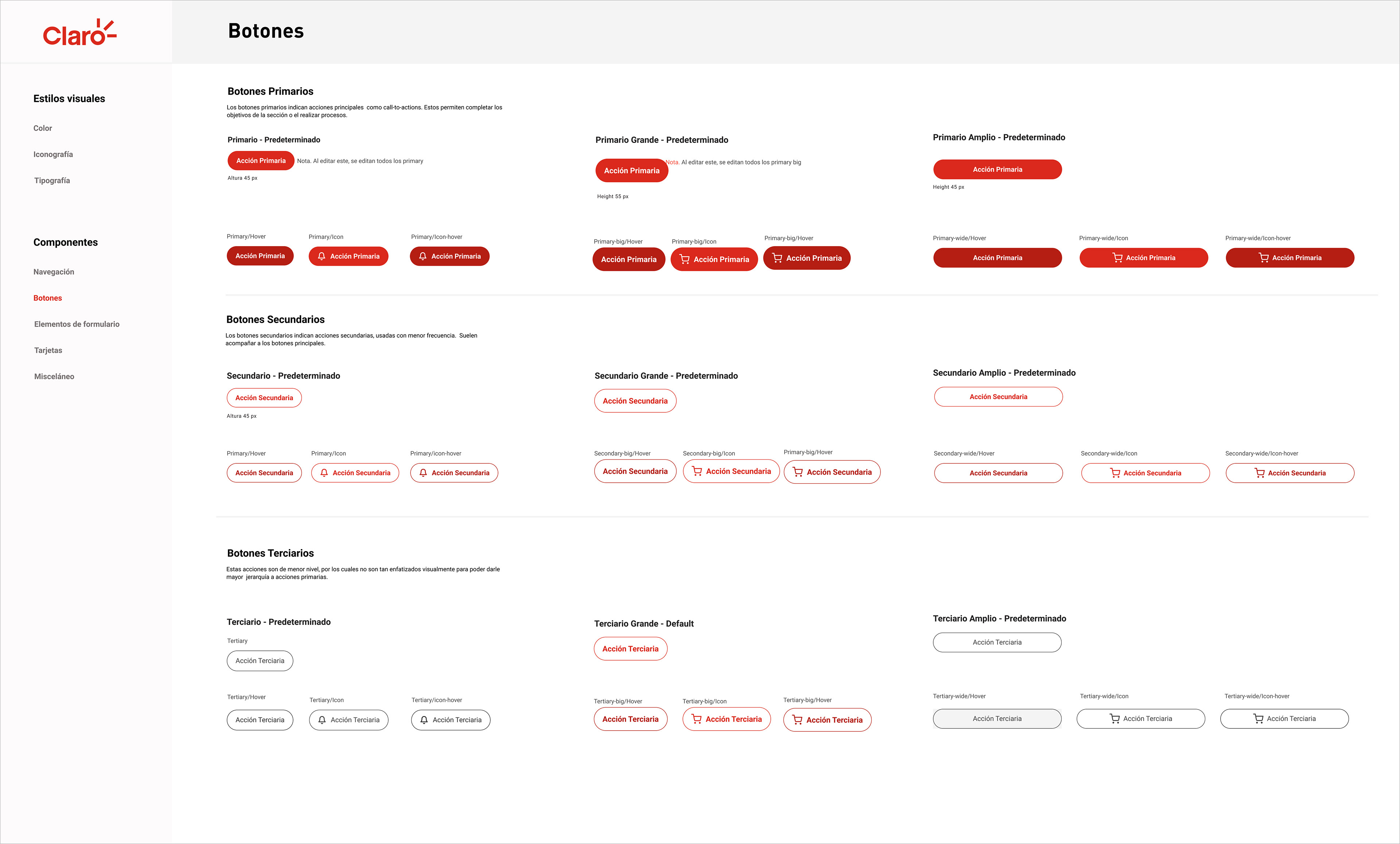
A closer look at how the system dictates all instances of buttons. Atlas was created in Figma
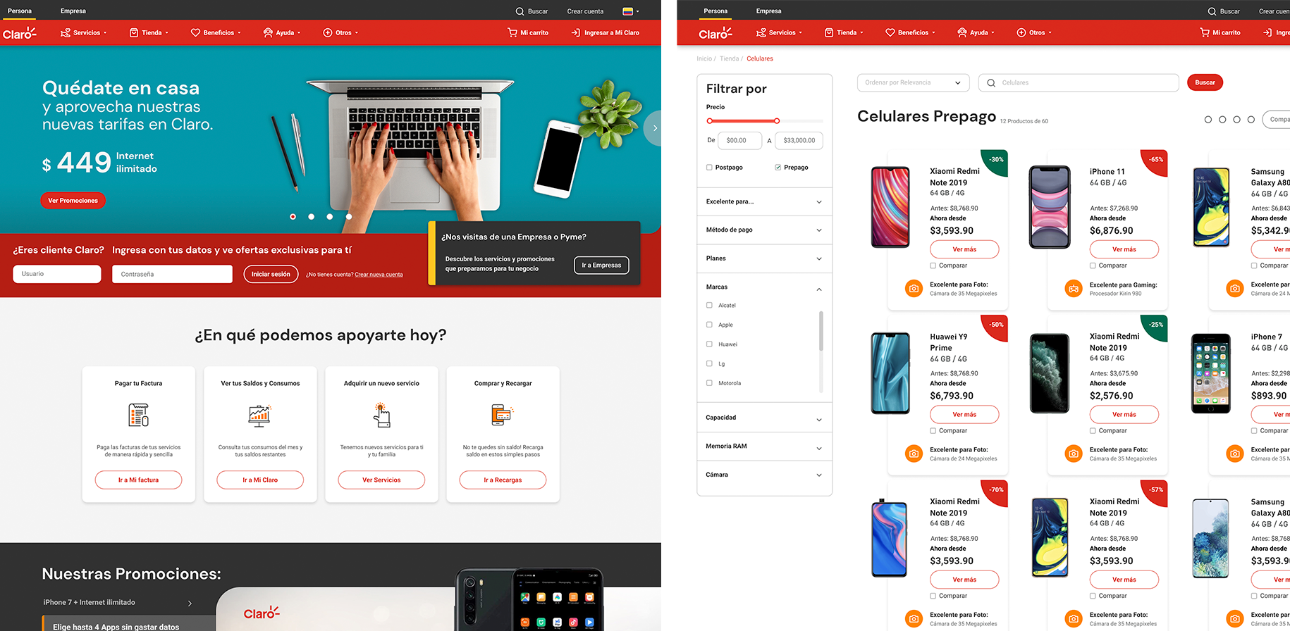
An example of the main Vicast Portal for all regions that would only vary in content but not design.
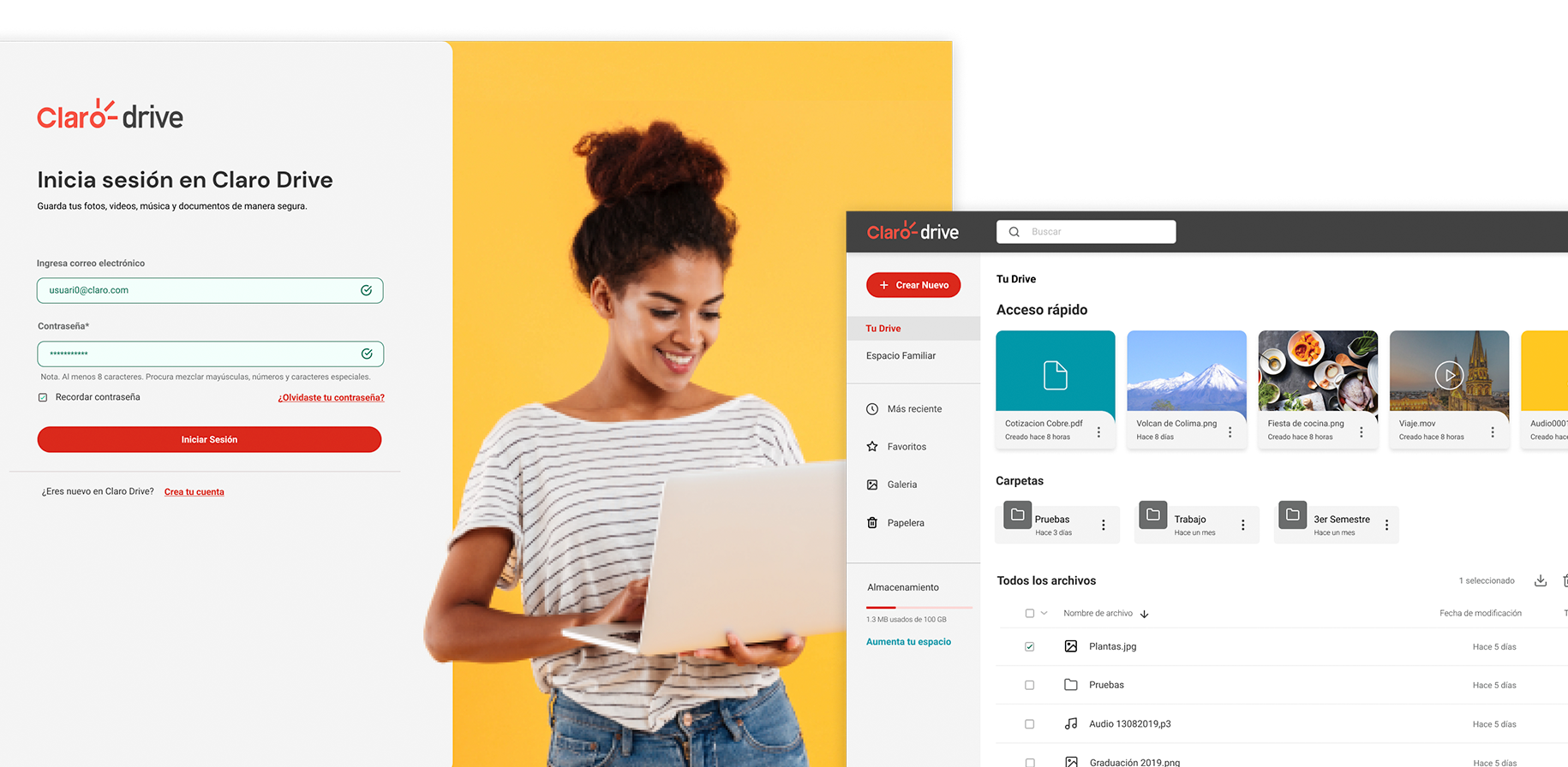
Atlas Design System applied to one of their file storage products.

Atlas Design System applied to one of their music streaming services across all regions.